01
The valley is still a person
The raised-arms figure in the old mark becomes the V of the M. Human, but no longer drawn.
Rebrand 2026
01 — The shift
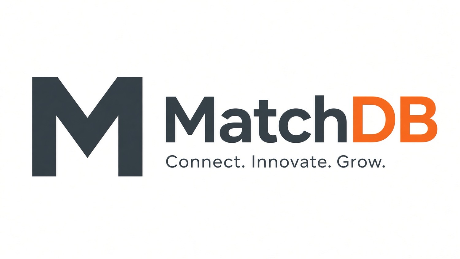
The retired mark told the story with a figure, an orbit, and a nested DB. The new mark is the M — same orange, same charcoal — for a Databricks talent network that has to hold at sixteen pixels and on a conference wall.
MatchDB
Connect. Innovate. Grow.
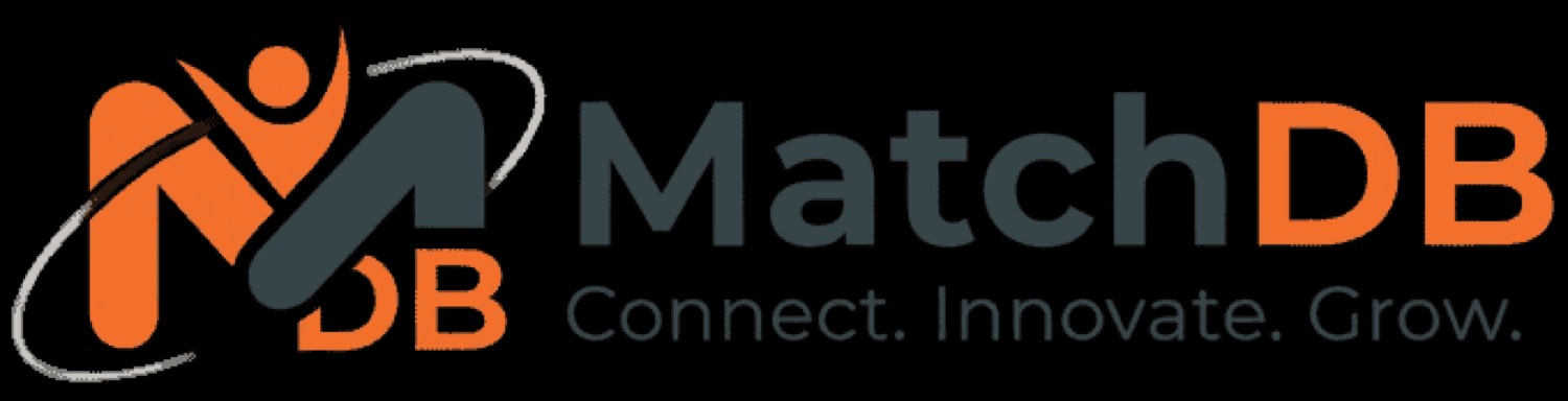
Drag to compare the retired mark with the new identity
02 — The idea
01
The raised-arms figure in the old mark becomes the V of the M. Human, but no longer drawn.
02
Orange is reserved for DB in the wordmark — the lakehouse, not a generic database. Match is the act: certified consultants to the right project.
03
Orange on charcoal. Charcoal on orange. That pair is the system for matchdbtalent.com, events, and print. Everything else is a supporting ground.
Connect. Innovate. Grow.Brand line unchanged. On the site it sits next to Premier Databricks Talent Network — one is voice, the other is what we are.
03 — The mark
Two vertical stems. A deep valley. The point of the V stops short of the baseline so the letter can sit in a square without optical sag.


04 — Lockups
The M is never typeset. The word MatchDB is never drawn. They sit side by side, cap-height of the name aligning to the top of the mark, tagline locking to the name — not the M.
Primary — paper
MatchDB
Connect. Innovate. Grow.
Reverse — ink
MatchDB
Connect. Innovate. Grow.
Field — orange
MatchDB
Connect. Innovate. Grow.
Name only
MatchDBMark only
05 — Color
Five colors. Tap a chip to copy the hex. Signal orange is the only chromatic color — never dilute it into a gradient.
Signal Orange
Accent, the DB in the wordmark, the mark on charcoal, hire/join actions.
Charcoal
The letterform, Match wordmark, type on paper.
Ink
Dark fields, reverse lockups, long-form reading on screen.
Paper
Default ground. Print stock. The board itself.
Mist
Hairlines, chips, quiet structure. Never a fill for the mark.
06 — Type
Montserrat holds the wordmark so the custom M can sit next to a related gothic without competing. Manrope does the reading.
MatchDB
MatchDB Talent · Premier Databricks Talent Network
ABCDEFGHIJKLMNOPQRSTUVWXYZ
abcdefghijklmnopqrstuvwxyz
0123456789
Wordmark and display
MatchDB
700 · tracking −0.03em · never below 18px for the logotype
Montserrat
UI, guidelines, body
Connect. Innovate. Grow.
400–600 · 1.5 leading · pretty wrap
Manrope
07 — Construction
Clear space is half a stem on every side. The valley point sits at 0.8 of cap height so the mark centers in a square.
08 — In use
App icon
Orange field at 1024. Charcoal field for dark OS. Paper at 32px and below.
Card
MatchDB
Connect. Innovate. Grow.
matchdbtalent.com
Product chrome
MatchDB
Premier Databricks talent, matched.
matchdbtalent.com
Certified experts. Right projects. Faster.
The mark holds the corner. Orange is used once — on DB, on Post a job, never as a wash behind type.
Title slide
MatchDB
Certified Databricks talent
Connect. Innovate. Grow.
09 — Rules
The stems are a unit. Scaling on one axis breaks the valley.
The M is a letter, not an icon to tilt.
No strokes, glows, or drop shadows on the letterform.
Orange and charcoal only. Mist is never a mark color.
The valley is the whole idea. Keep it intact.
The orbit figure is retired. Don’t pair it with the new M.
Orange M on charcoal. Charcoal M on orange. Match in charcoal, DB in orange. Tagline in Manrope, never inside the mark. If it doesn’t fit, use the M alone.